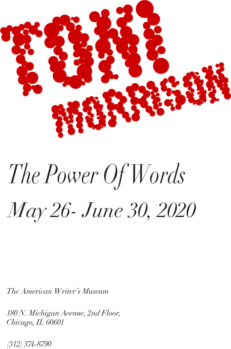
The Power of Words
The idea behind this project was to create a visual harmony between three different posters through the use of typography. I was given the names of three famous authors, and some additional information regarding a fictitious exhibit about said authors. The rest was up to me.
Typeface Exploration.

Workshops.


Initial digital sketches.
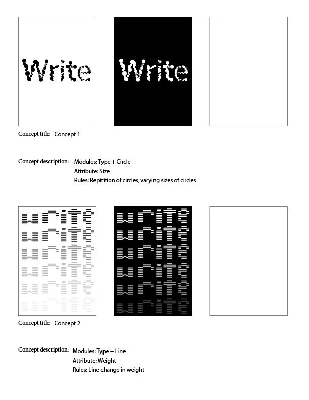
Initial Concept 1
Initial Concept 2

Initial Concept 3
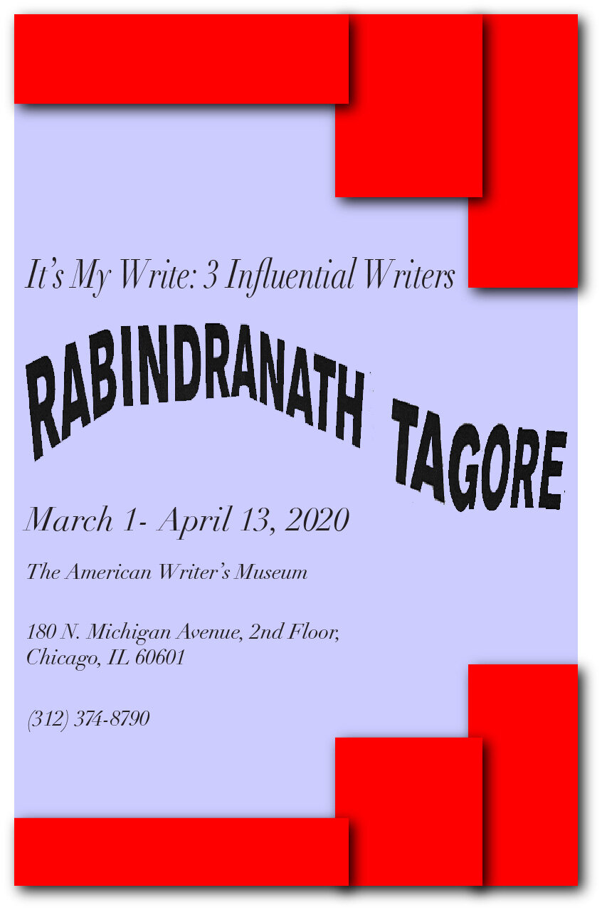
After my initial round of concepts, I decided to try and combine elements from each. I kept the graphic elements from the first and third concepts, however for the author's name I decided to go in the direction of repetition with the added layer of a descending brightness with each repeat of the name.
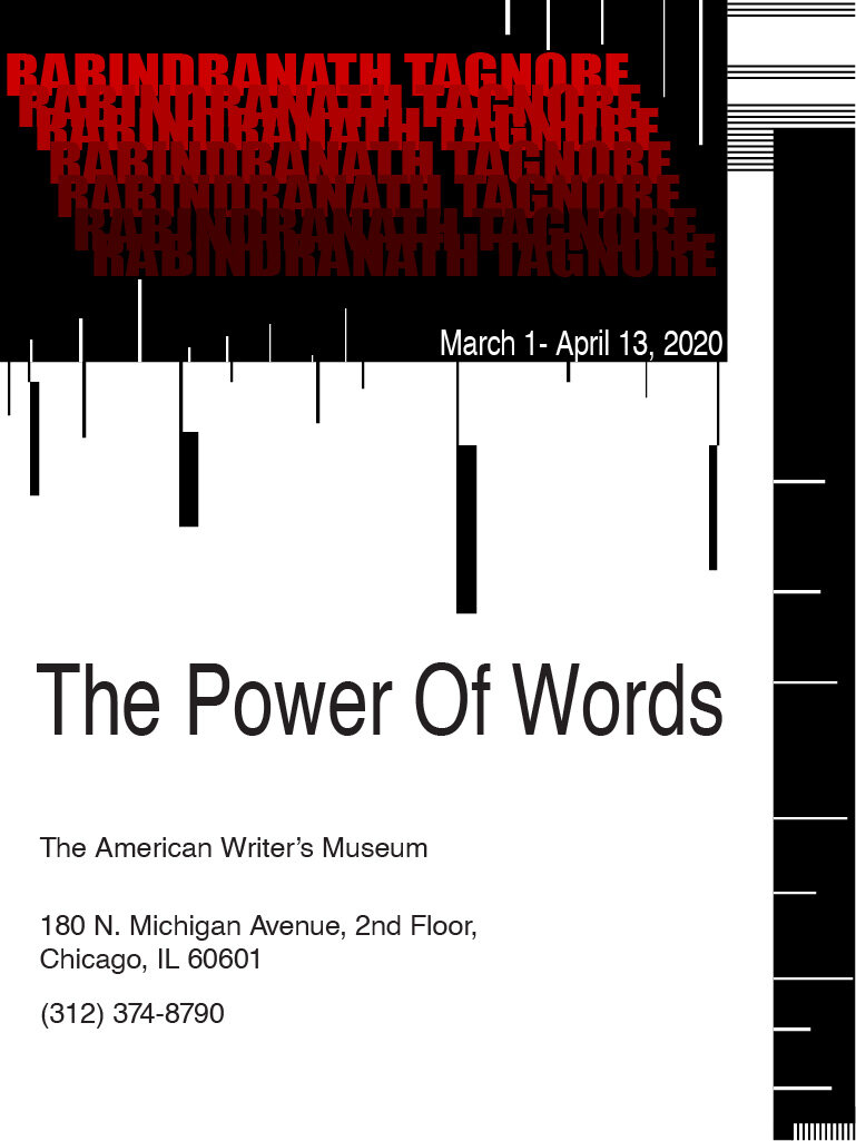


The system was the same for each poster, so I also threw in a distinct color for each other to add some differentiation. The fullest color is right in the middle on every poster, and it becomes more and more faded as the name gets closer to the edge. The reasoning behind this was to convey that these authors did not become famous overnight. At the start of their careers, they were on the fringes of the writing world, their names were lost in a sea of other names. As time went on their names became more and more recognizable, until eventually they would become titans of the writing world, people other aspiring authors could look up to for inspiration and guidance.


The final step for this project was to add just a bit more visual flare. I made the background of each poster a color variation of the color of the author’s name on the poster that preceded it. On top of allowing the text to pop, it created a visual harmony between all three posters that ultimately resulted in a tightly knit poster series.


